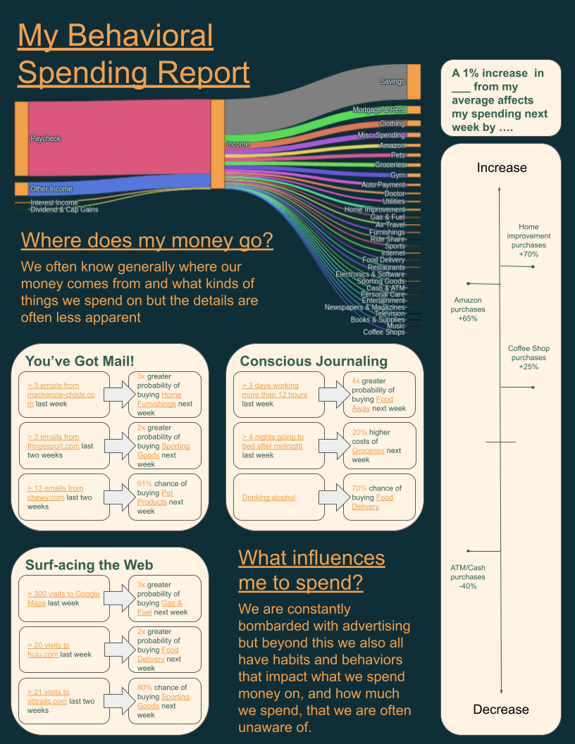
 [OC] How my behaviors and external influences impact my spending
Submitted by thehallmarkcard t3_111fuza
/f/dataisbeautiful
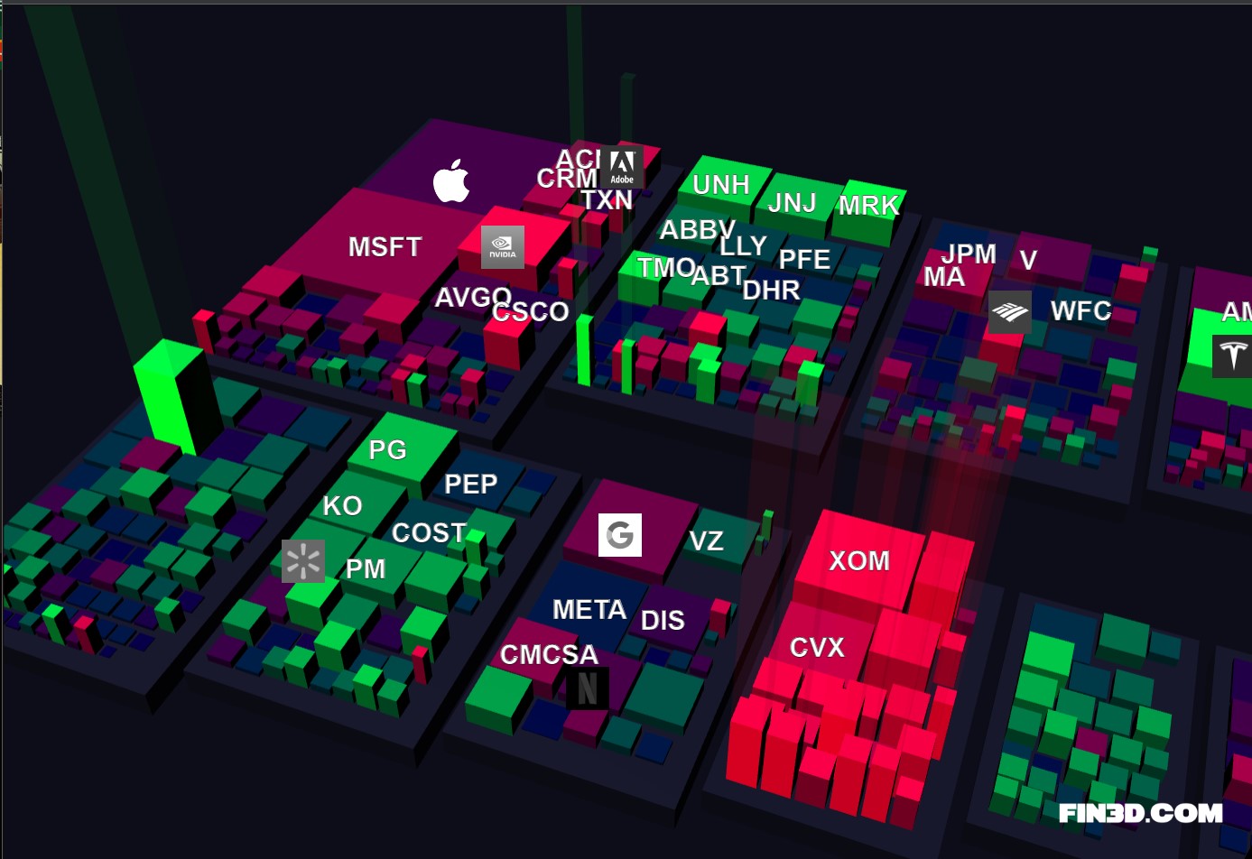 [OC] Fin3D.com - S&P 500 market data visualized in 3D
Submitted by Rockclimber88 t3_11k5rk8
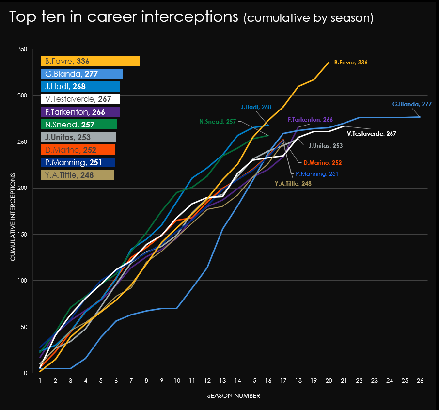 [OC] Charting season-by-season accumulative interceptions for the top ten career leaders, led by all-time interception king Brett Favre (NFL, American Football)
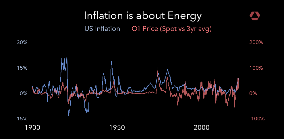 Oil v. US Inflation [OC]
Submitted by rosetechnology t3_xwddlc
Submitted by Broad-Vacation-642 t3_yf1gme
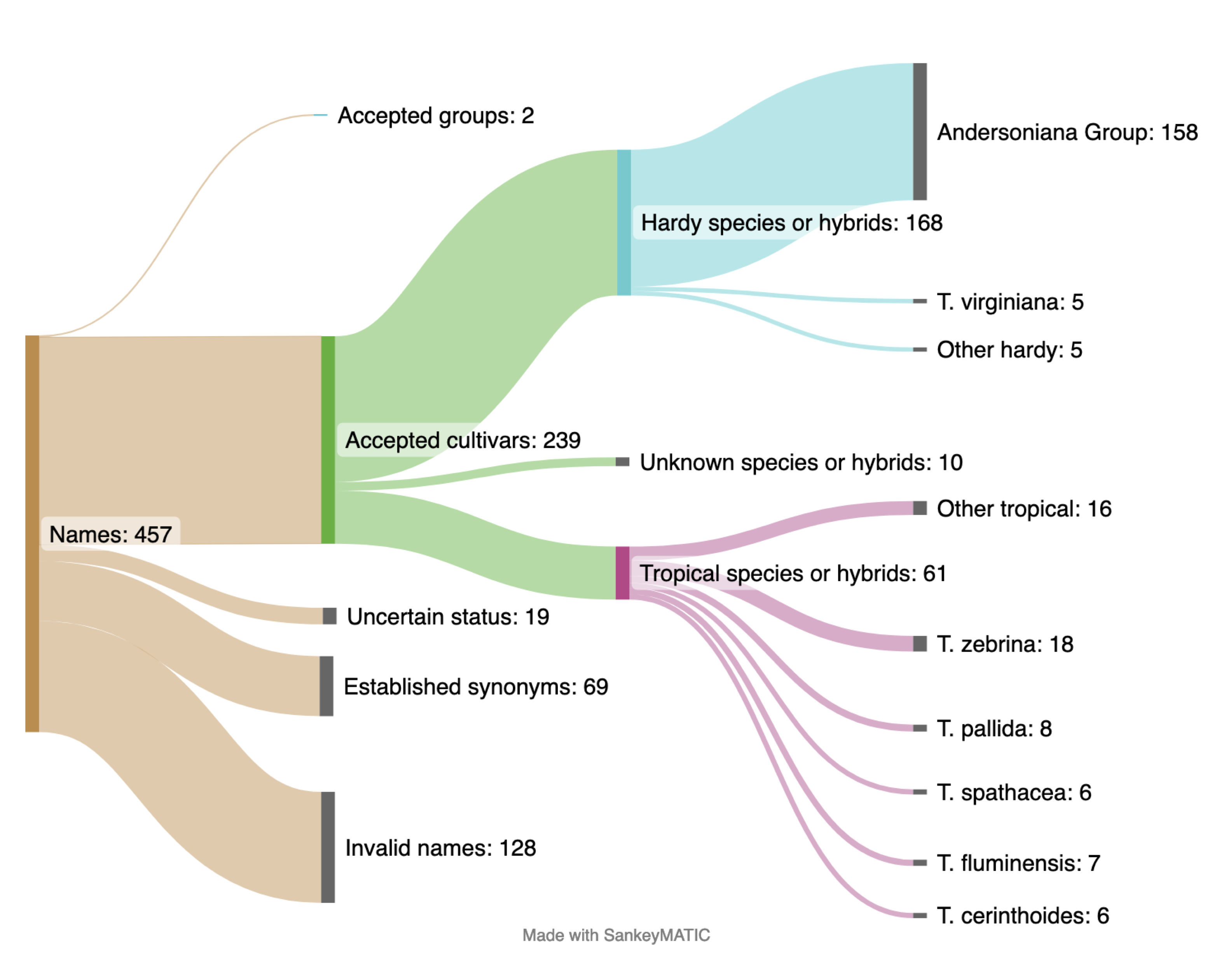 [OC] Breakdown of Tradescantia plant cultivar names by validity and which species they belong to
Great article using data to show the rise in Covid misinformation on Twitter. If there was no groundswell of coordinated misinfo on Twitter, this chart would be full of disconnected dots. Data and graphs supplied by Timothy Graham of the Queensland University of Technology
abc.net.auSubmitted by pedrointas t3_zfdrpq
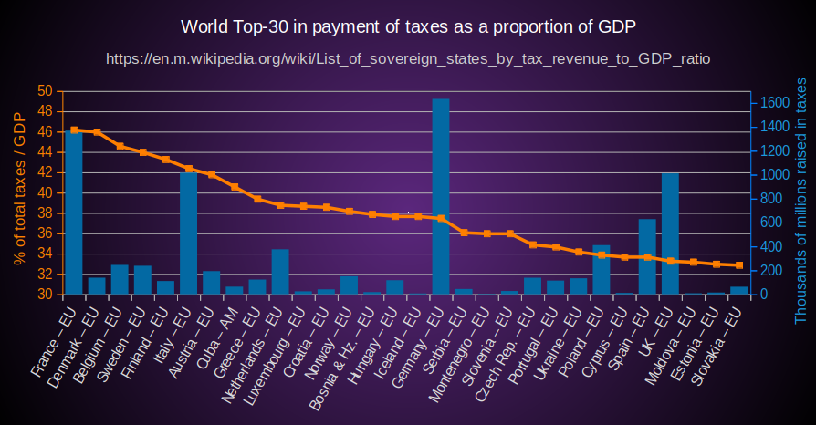 [OC] World Top-30 in payment of taxes as a proportion of GDP (2020)
Submitted by UsandoFXOS t3_zxrfng
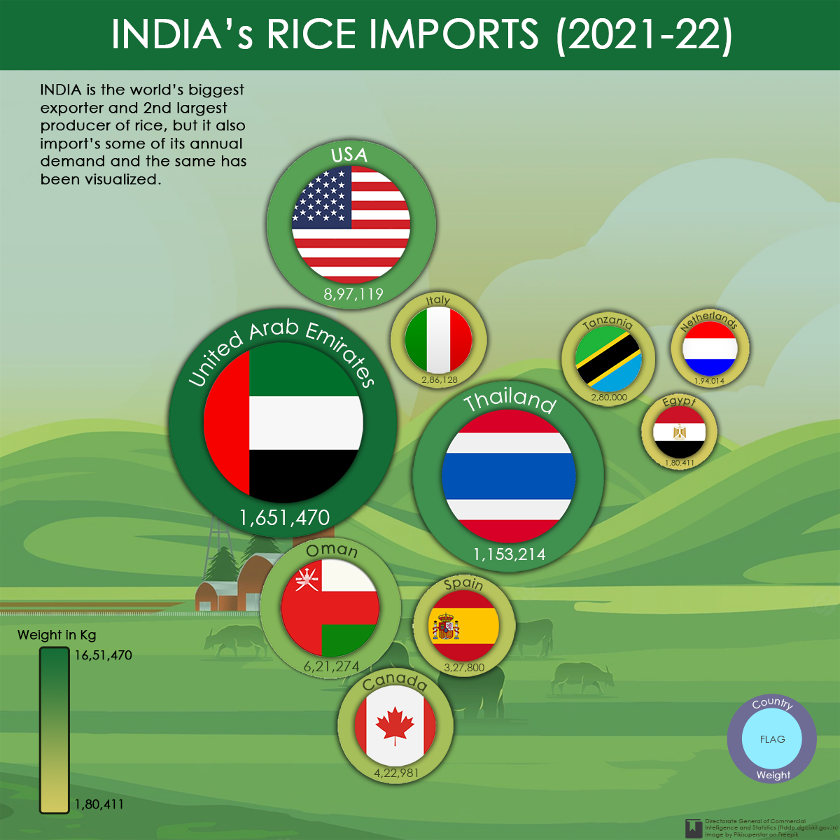 [OC] India's rice imports of top 10 countries on the basis of quantity for the year 2021-22
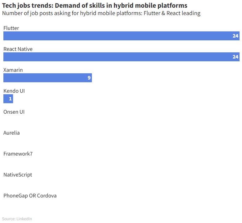 [OC] According to LinkedIn, Flutter and React Native are the most asked skills for companies in mobile hybrid platforms
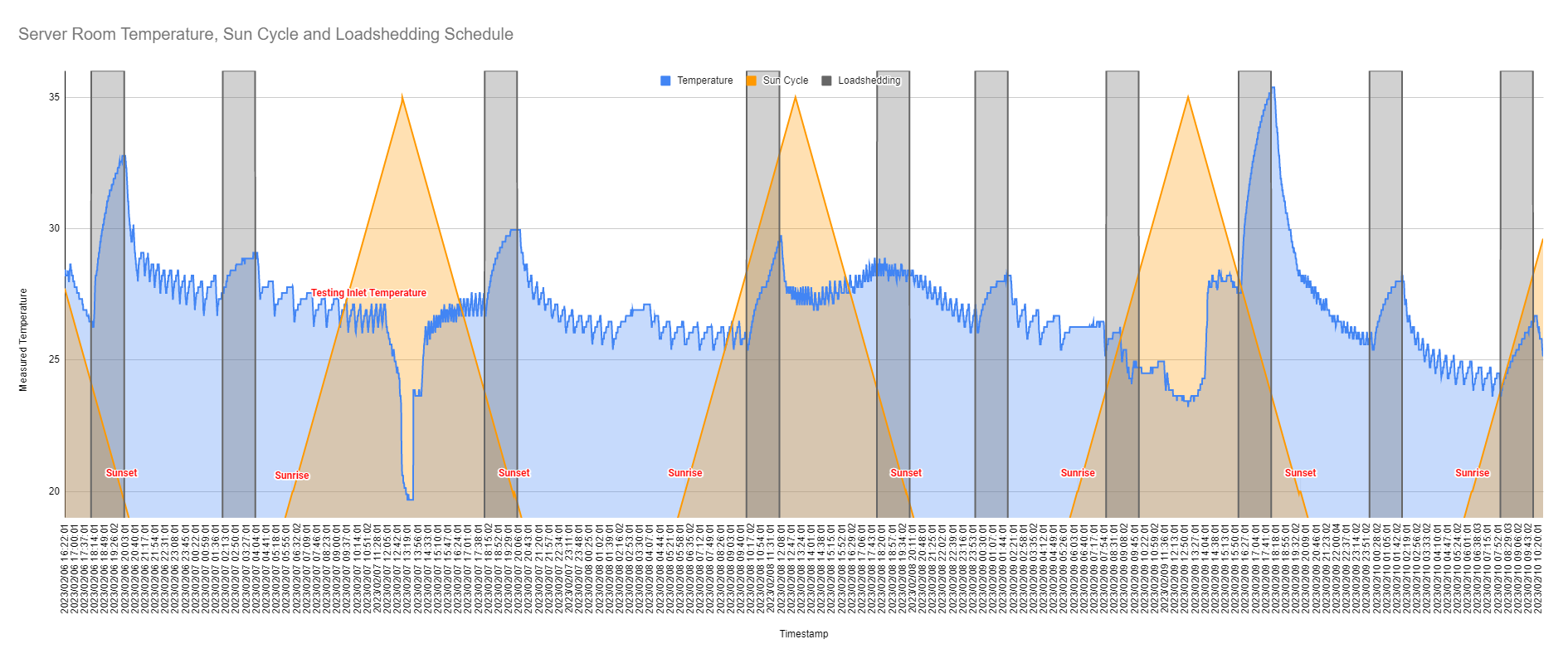 [OC]The effect loadshedding has on my server room temperatures. I generally run my room between 23C and 25C, but with loadshedding it skyrockets and I only realised how much when I used a phidgets temperature sensor to graph how the temperatures change during loadshedding.
Submitted by quintinza t3_10yrovk
Submitted by PHealthy t3_112yh3l
Submitted by lemonzestttttttt t3_11rystz
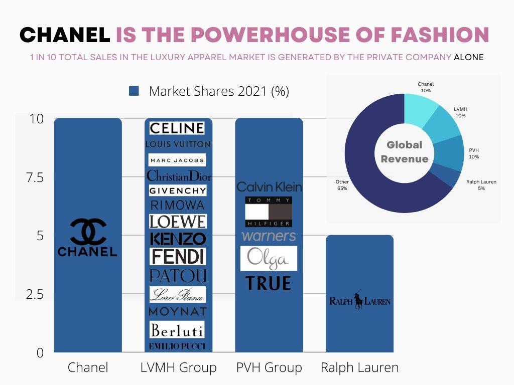 [OC] Chanel is THE powerhouse of fashion
Submitted by alison359 t3_xw7fyd
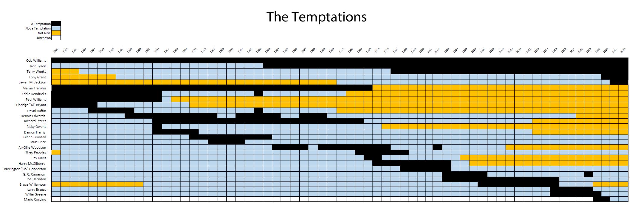 [OC] The Temptations.
Submitted by MeIIowJeIIo t3_10elhhz
Submitted by dwaxe t3_11s0you
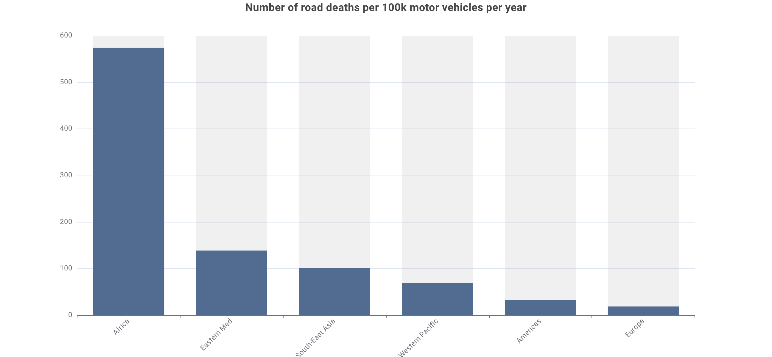 [OC] Number of road deaths per 100k motor vehicles per year
Submitted by scottpaulin t3_yea31i
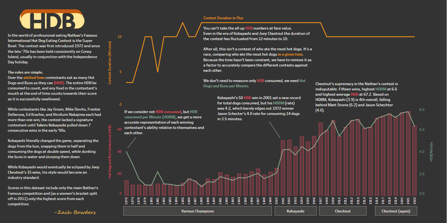 Nathan's Famous Hot Dog Contest (Kobayashi isn't as good as might think) [OC]
Submitted by Crash_Recovery t3_y35nic
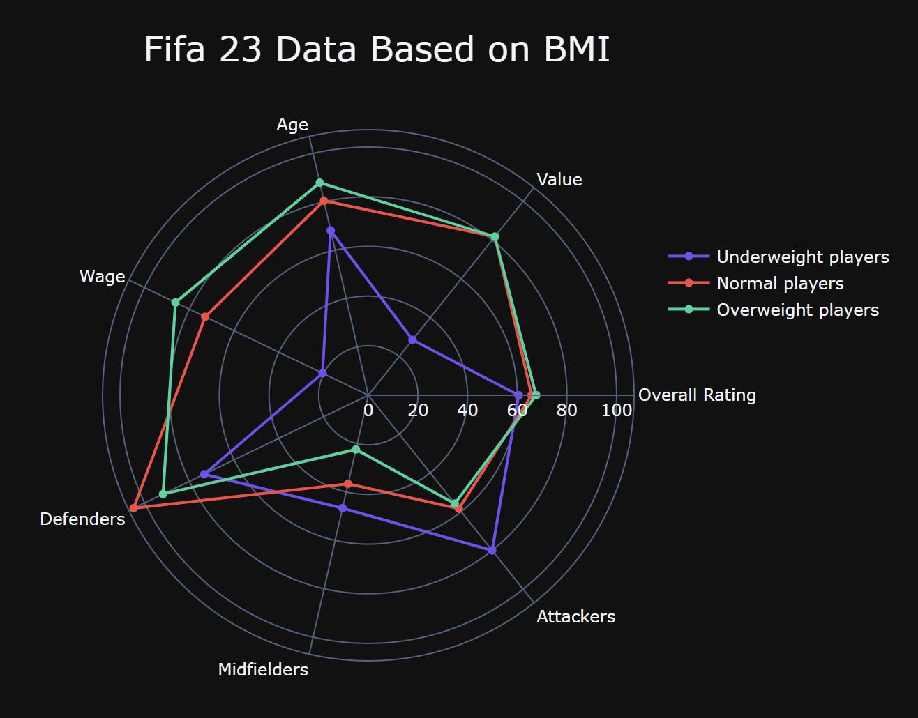 [OC] Fifa 2023 Data Based on BMI (Body mass index)
Submitted by alx_www t3_y4tdbu
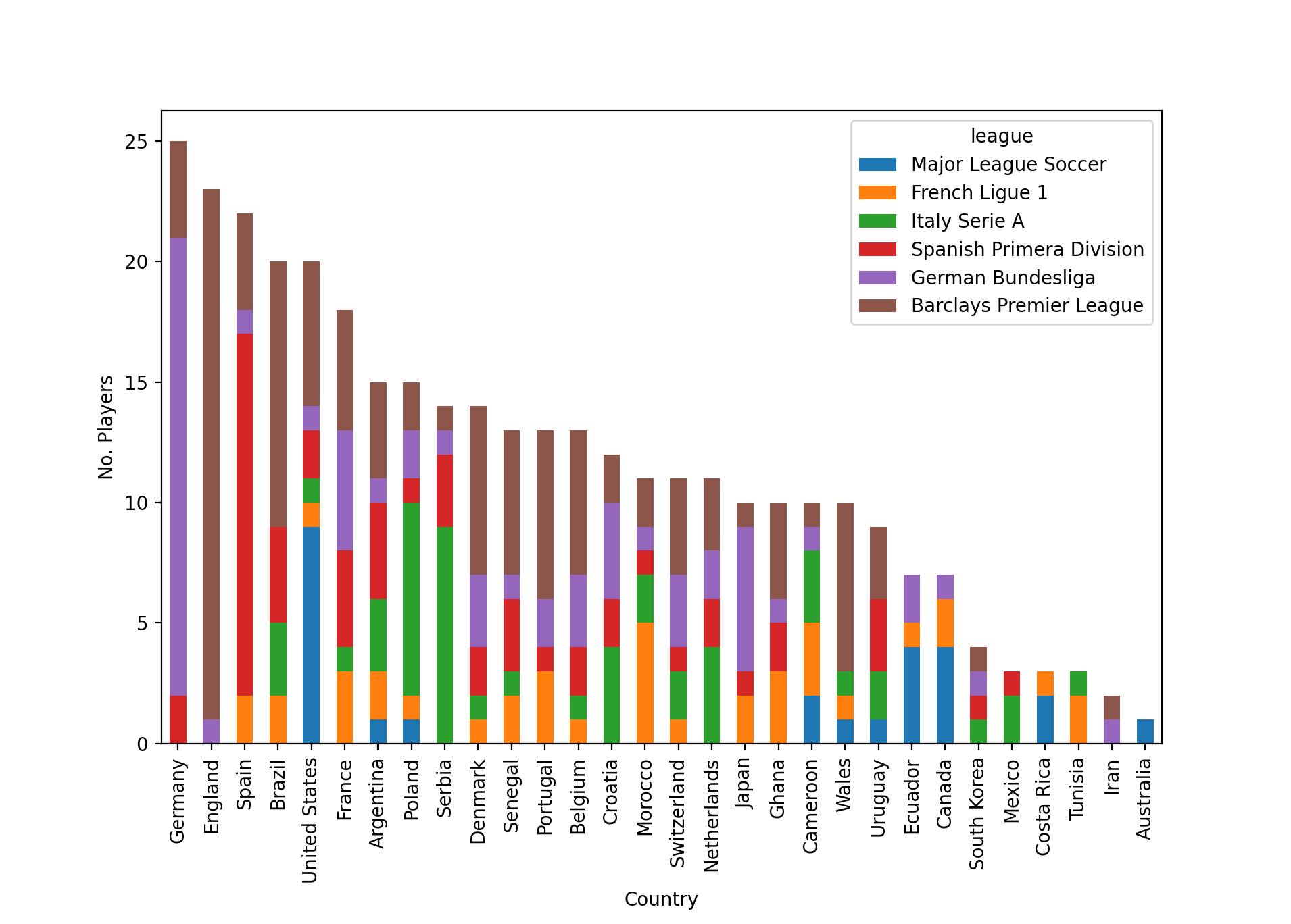 [OC] What leagues do players that make up the 2022 World Cup Squads play in?
Submitted by d0xical t3_z3jqn2
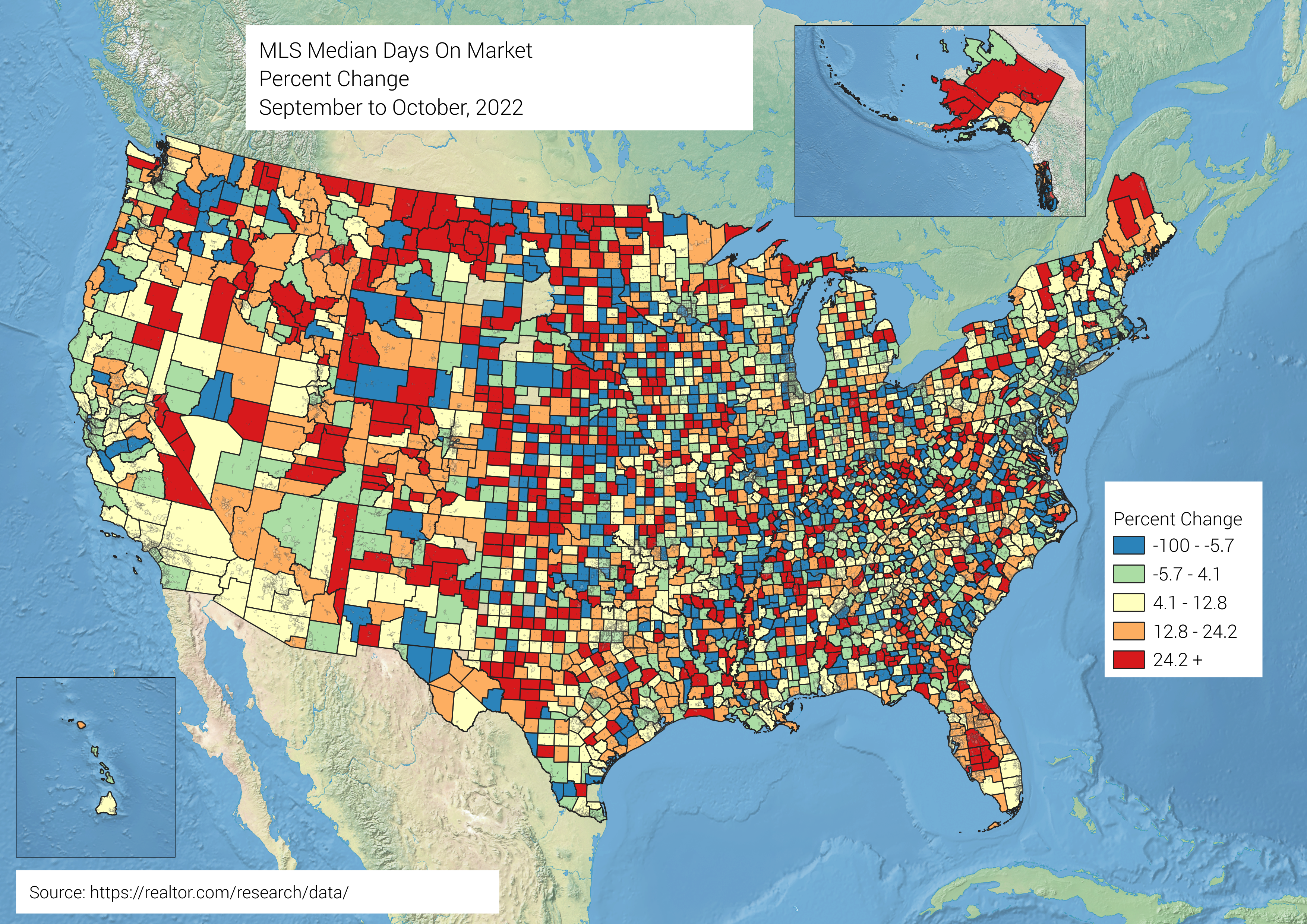 USA Home Listings, Median Days on Market, Percent Change September to October, 2022, by US County [OC]
Submitted by publius-varus t3_ys6097
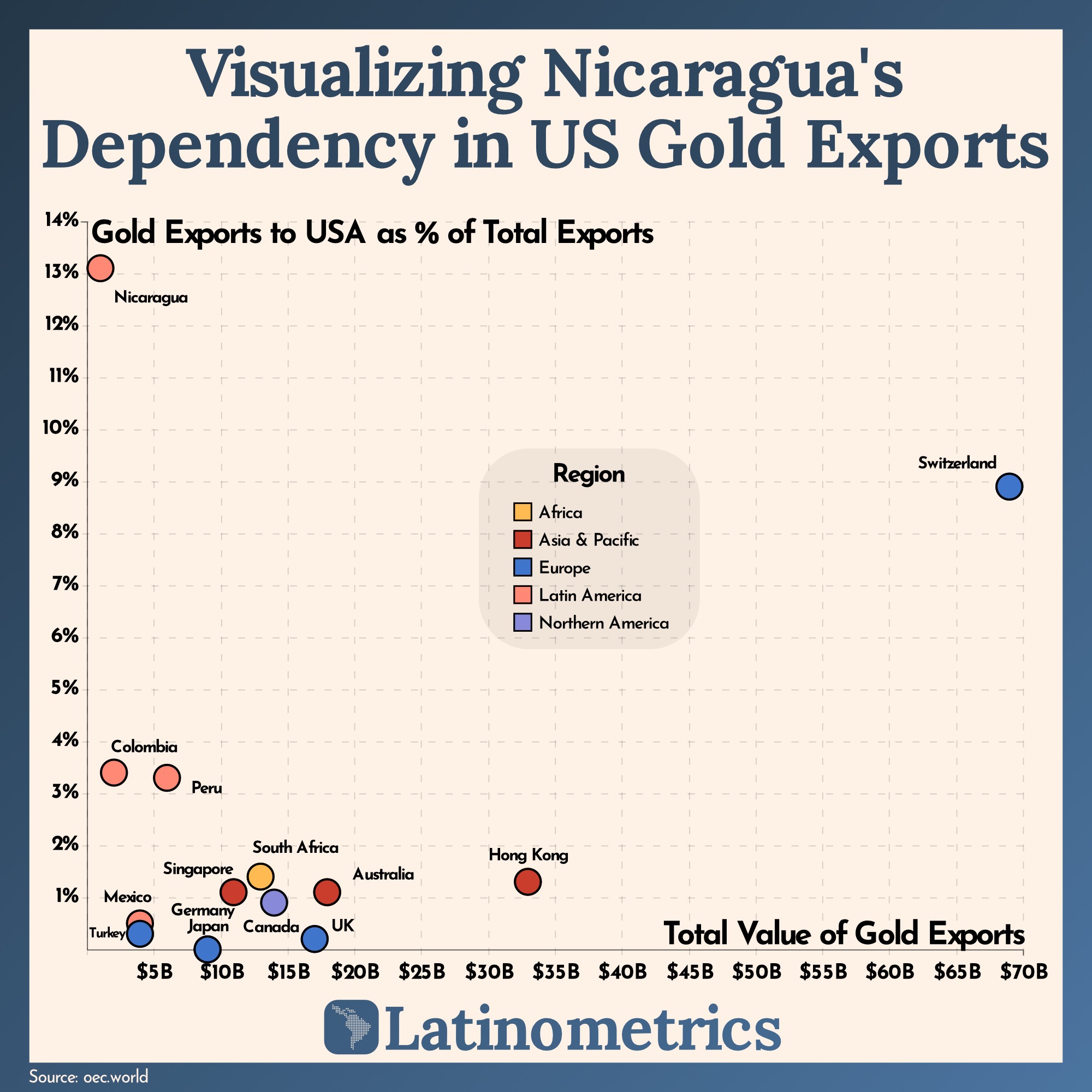 [OC] Visualizing Nicaragua's Dependency in US Gold Exports
Submitted by latinometrics t3_ysnofn
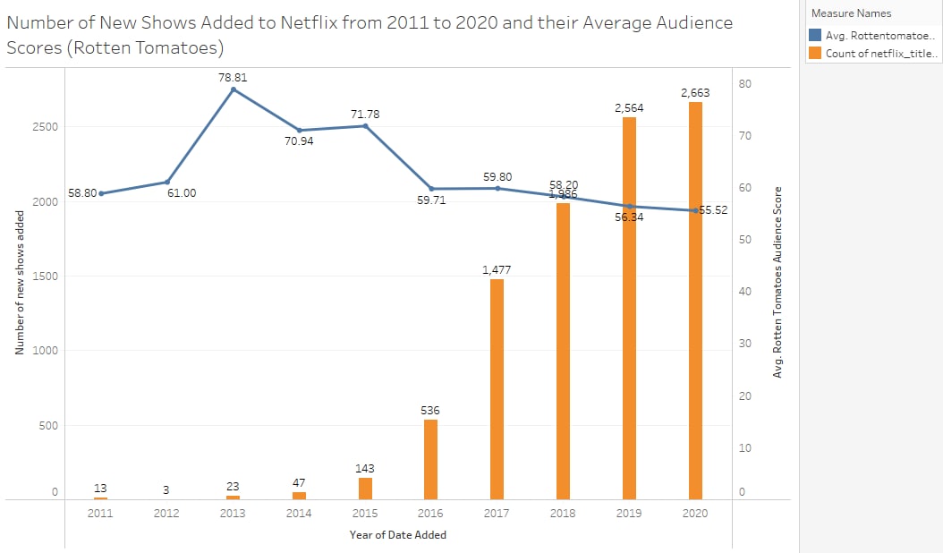 [OC] Is Netflix's catalogue quantity over quality or vice versa?
Submitted by biantongfrom t3_yvx6nd
Submitted by Iroh4ii t3_z6gkcd