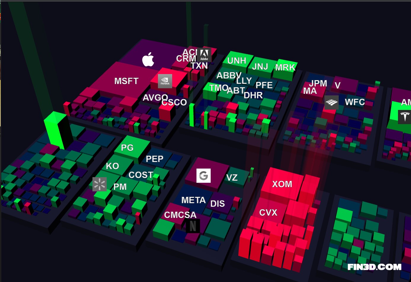
 [OC] Fin3D.com - S&P 500 market data visualized in 3D
Submitted by Rockclimber88 t3_11k5rk8
/f/dataisbeautiful
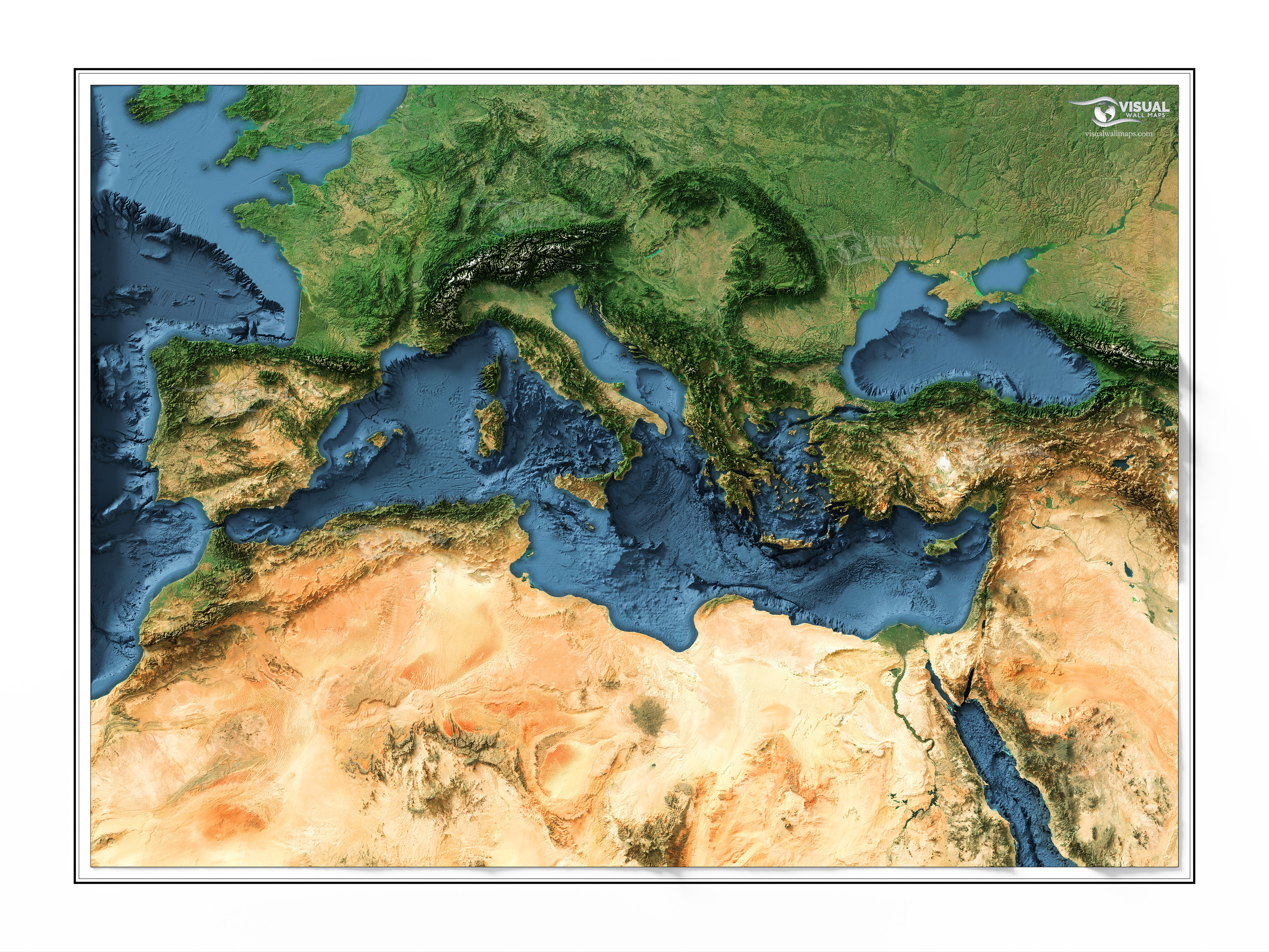 A shaded relief map of The Mediterranean Sea Region rendered from 3d data and satellite imagery [OC]
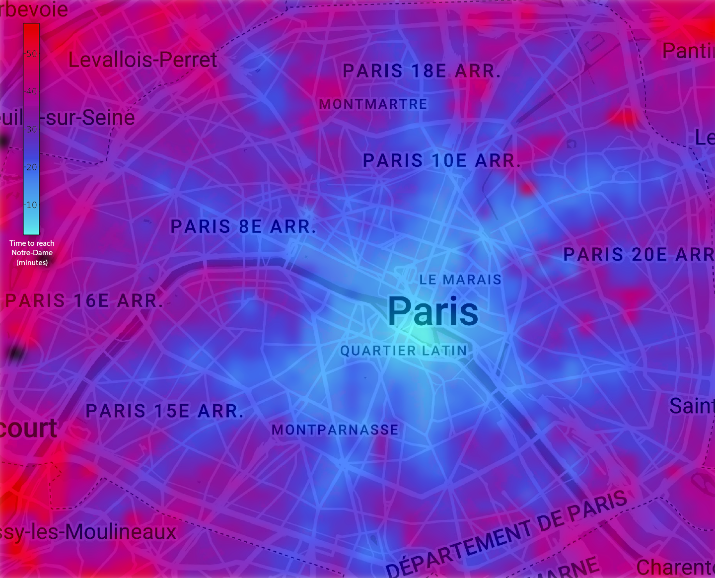 [OC] Time to reach Notre-Dame from any location in Paris, using public transports
Submitted by Eyusd t3_118832k
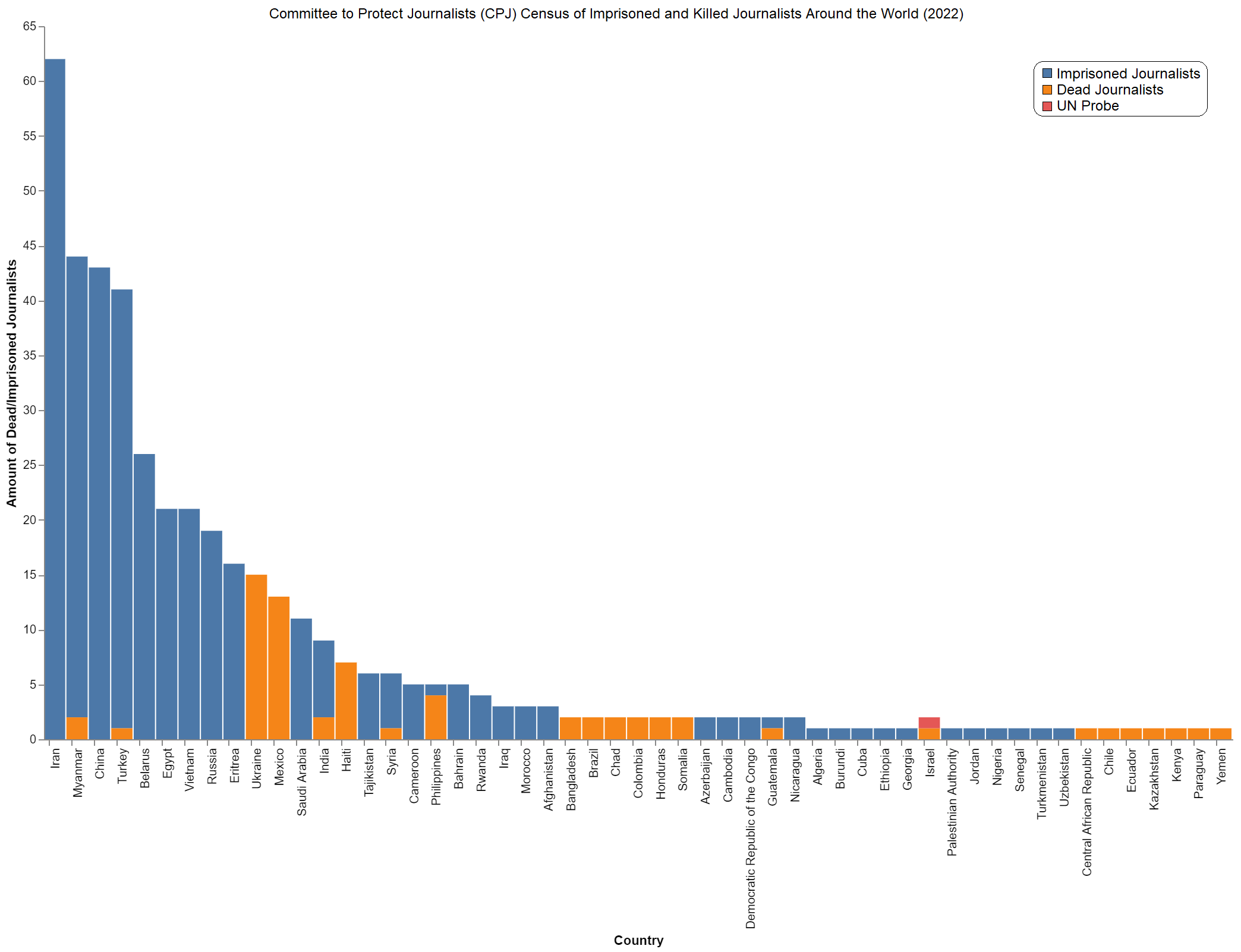 [OC] "Committee to Protect Journalists" (cpj.org) census of imprisoned and killed journalists around the world (2022)
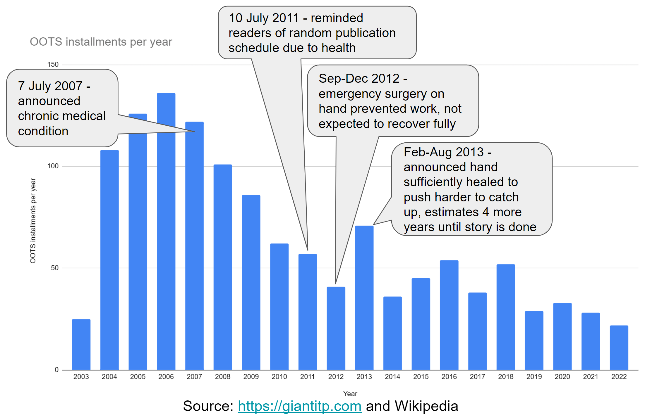 [OC] A webcomic artist's annual output correlated with decline in health
Submitted by amatulic t3_1158bye
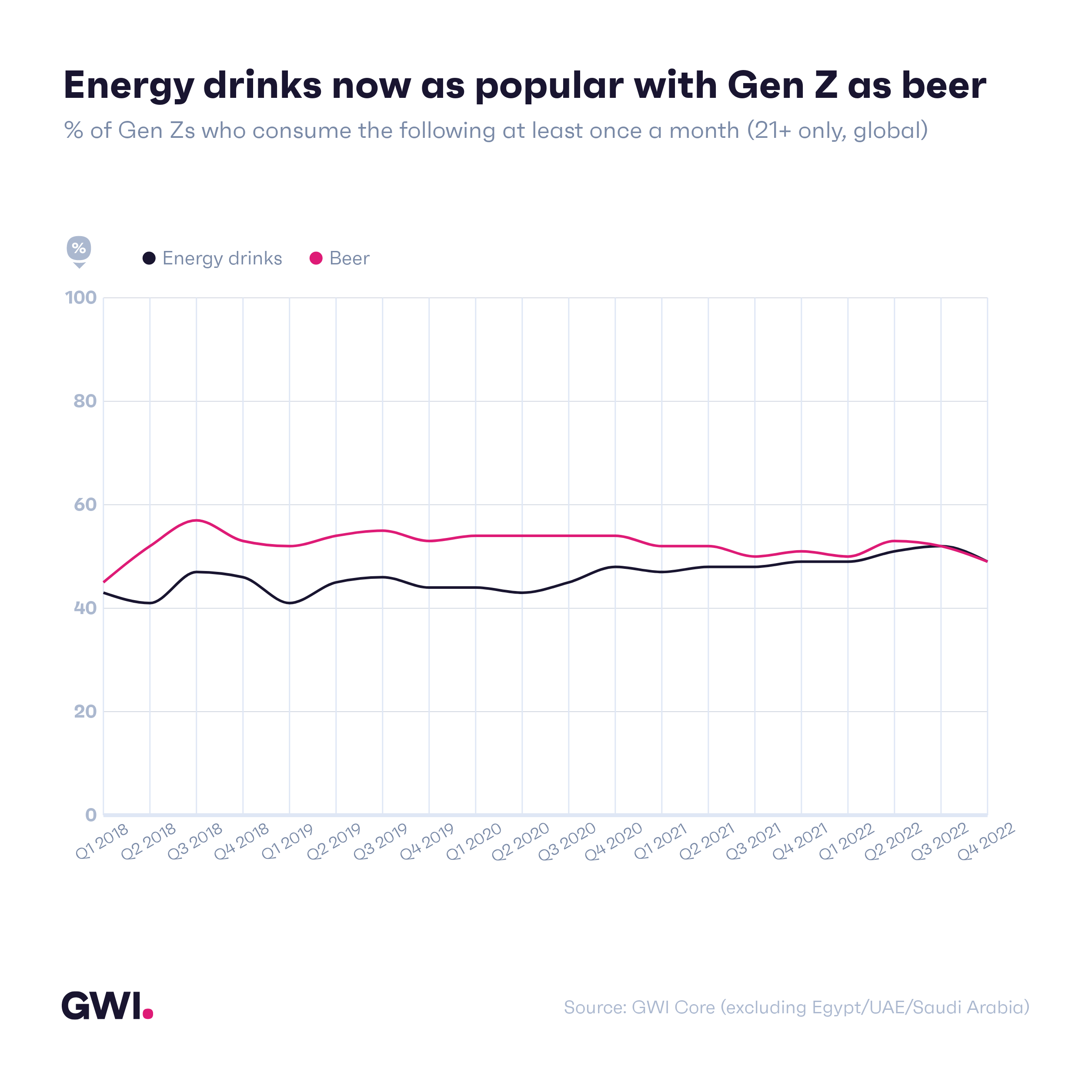 [OC] Logan Paul has great timing: energy drinks are now as popular with Gen Z as beer
Submitted by spicer2 t3_11e45yf
Submitted by PHealthy t3_112yh3l
Submitted by lemonzestttttttt t3_10zy0sr
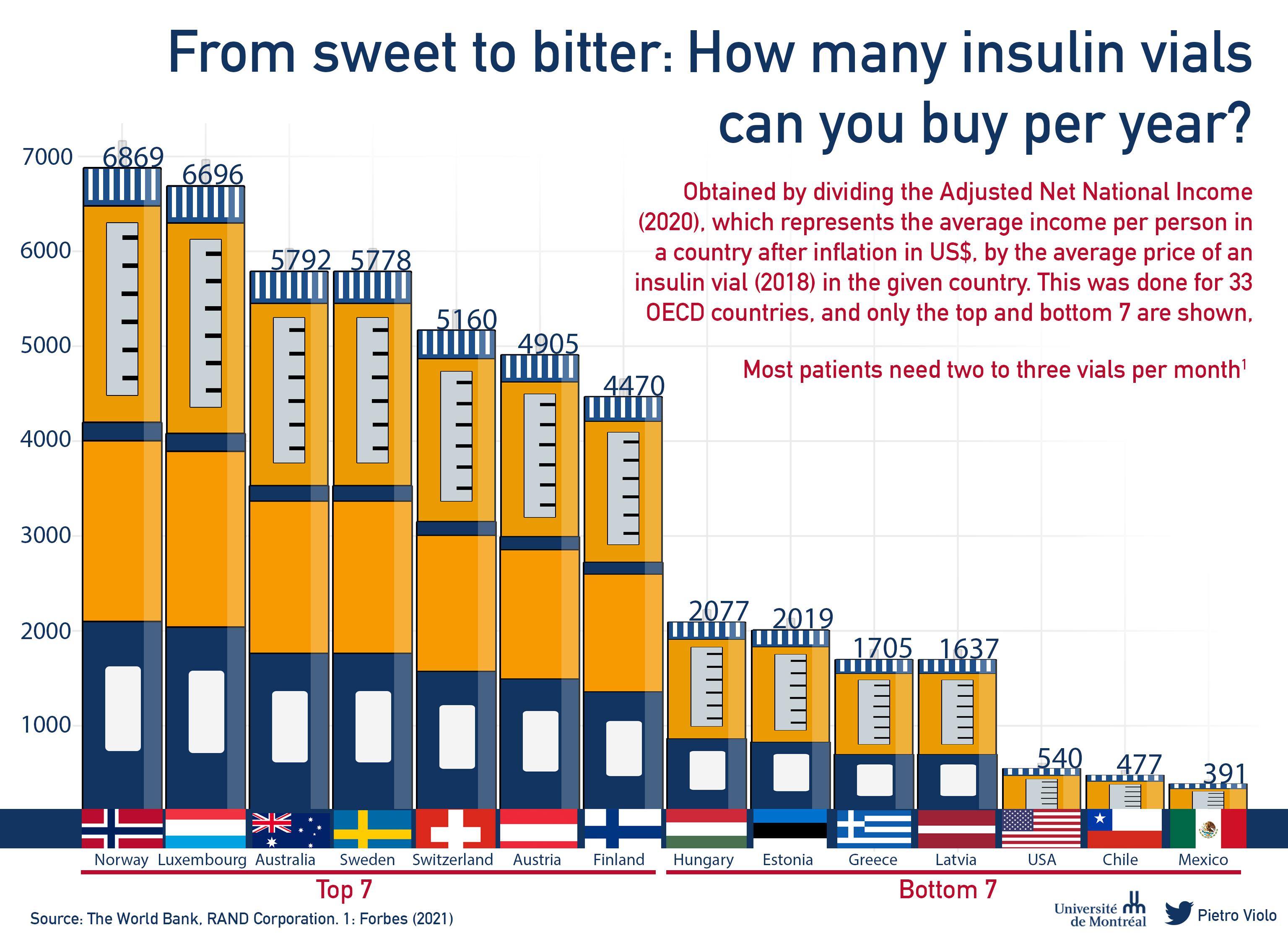 [OC] From sweet to bitter: How many insulin vials can you buy per year?
Submitted by PietroViolo t3_11ejwnp
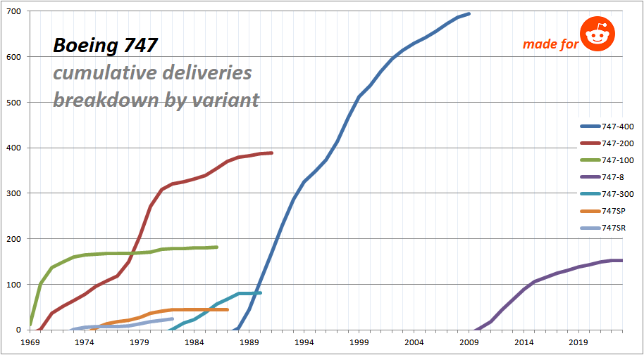 [OC] Boeing 747 cumulative deliveries breakdown by variant
Submitted by jnpha t3_10rpwq2
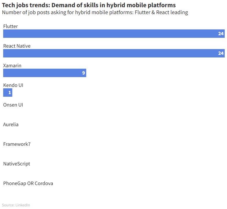 [OC] According to LinkedIn, Flutter and React Native are the most asked skills for companies in mobile hybrid platforms
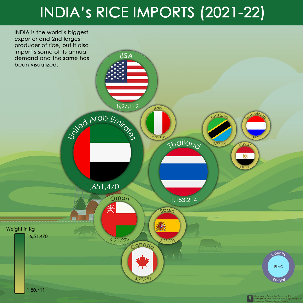 [OC] India's rice imports of top 10 countries on the basis of quantity for the year 2021-22
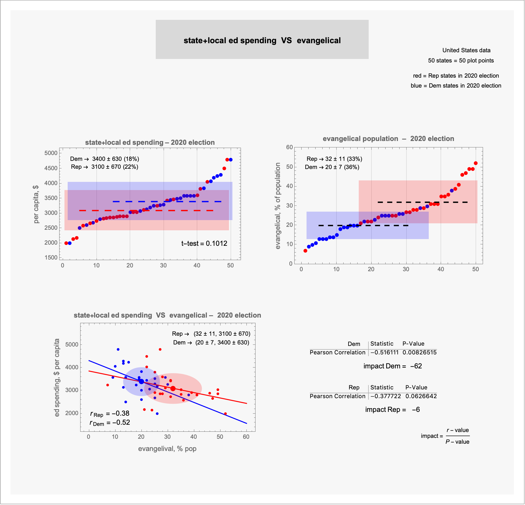 [OC] best-fit lines, correlations: ed spending vs evangelical –– 2020 election
Submitted by terrykrohe t3_10mdxdd
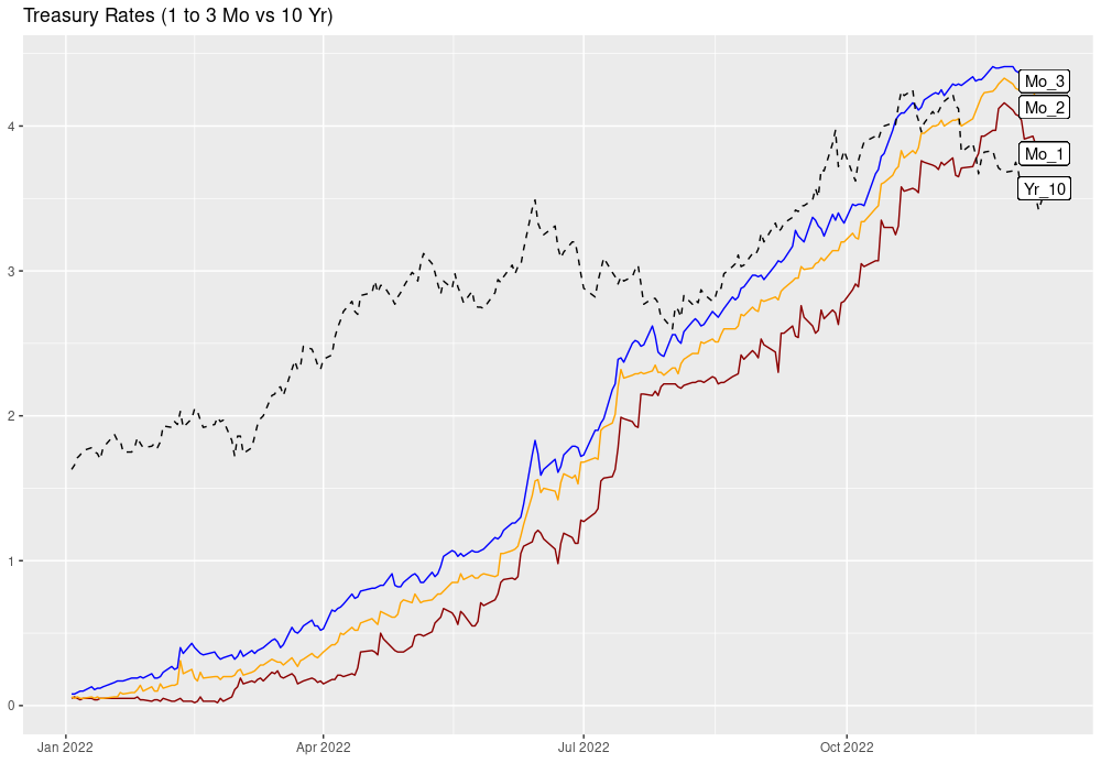 Treasury Rates: Short vs 10 yr [OC]
Submitted by matt2001 t3_zicsp6
Great article using data to show the rise in Covid misinformation on Twitter. If there was no groundswell of coordinated misinfo on Twitter, this chart would be full of disconnected dots. Data and graphs supplied by Timothy Graham of the Queensland University of Technology
abc.net.auSubmitted by pedrointas t3_zfdrpq
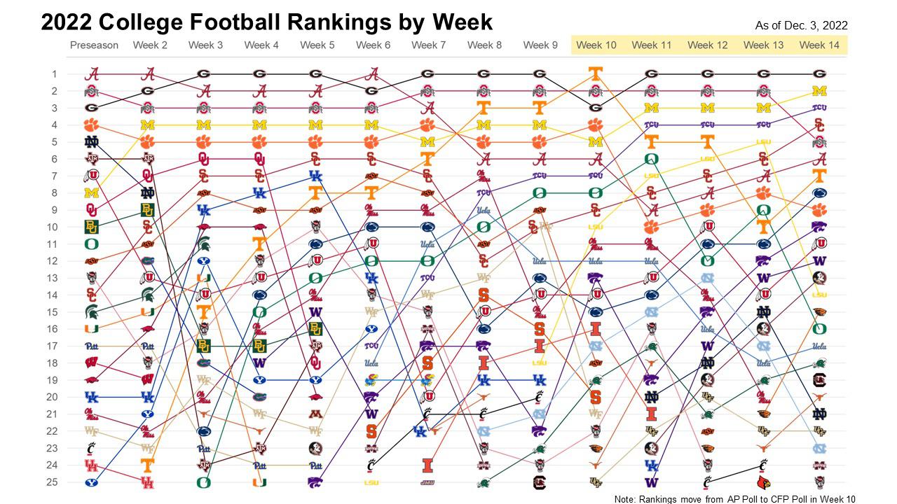 [OC] College Football Rankings by Week
Submitted by chasepsu t3_zbrgwh
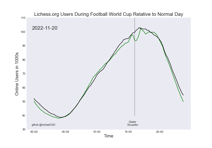 [OC] Lichess.org traffic during Football World Cup 2022 [UPDATED]
Submitted by somethingpretentious t3_zbfuq4
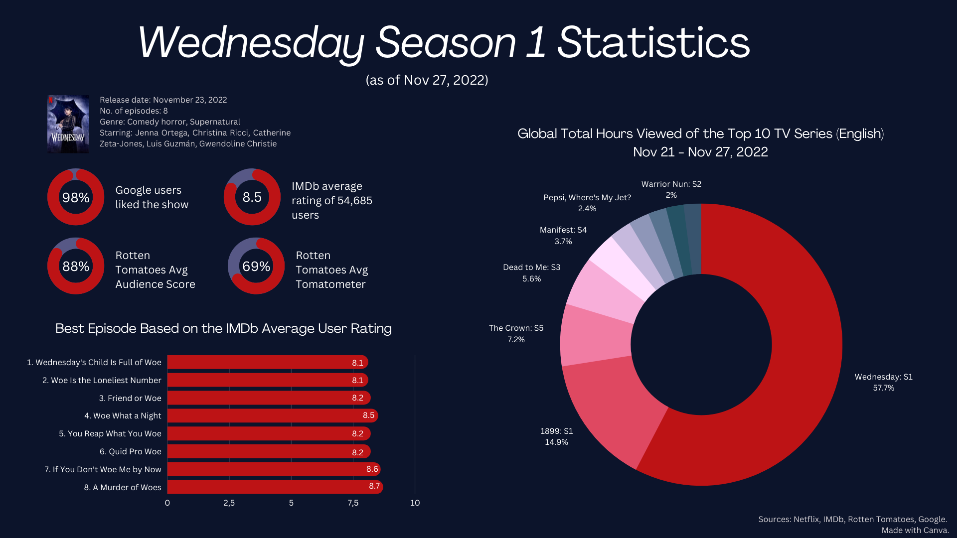 [OC] Netflix's "Wednesday" Global Viewing Statistics, Nov 23 — Nov 27, 2022
Submitted by CheetahOk8221 t3_z9nbre
 Airports Sorted by Locations Reached in Two Hops [OC]
Submitted by CharcoalCharts t3_z1jp5u
Submitted by L_Cranston_Shadow t3_z1h39c
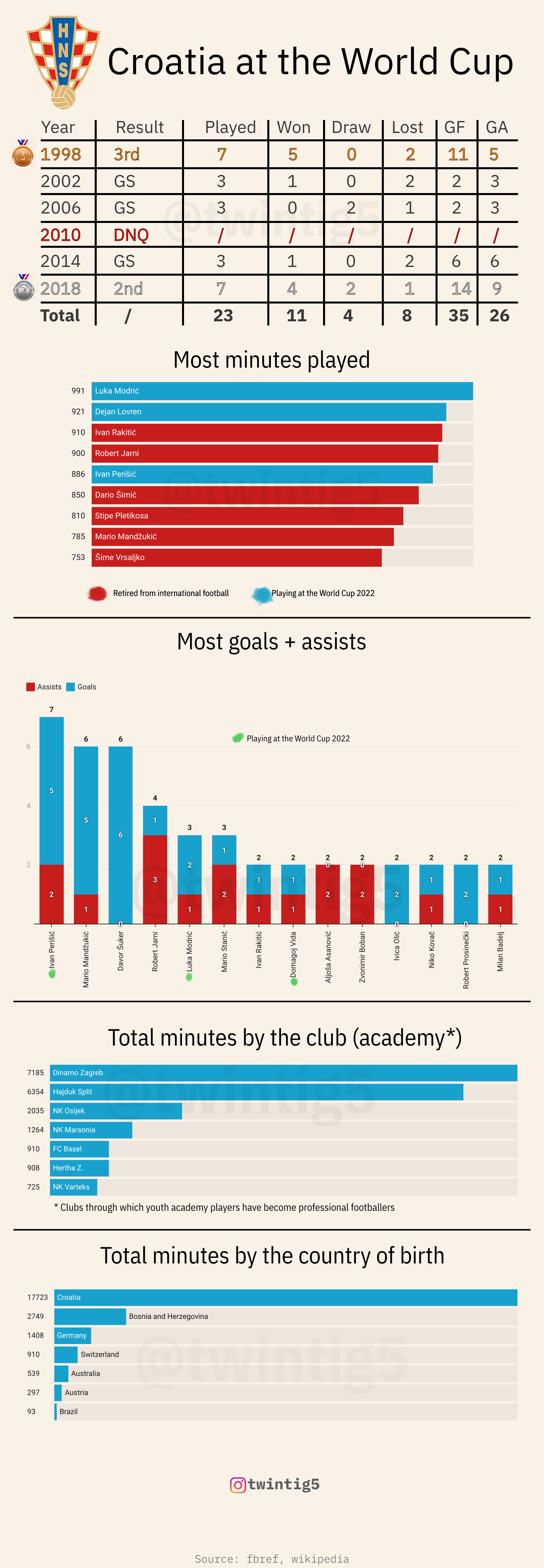 [OC] History of Croatia on the World Cup
Submitted by twintig5 t3_yzklx8
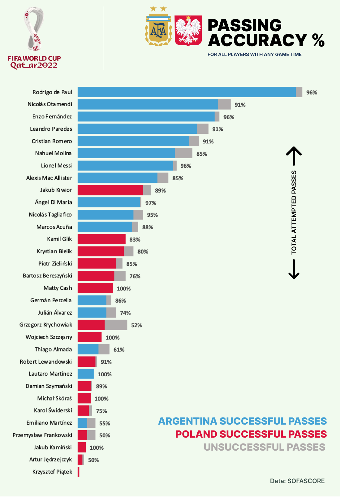 [OC] Argentina vs Poland Pass Accuracy (%) per Player
Submitted by fifthfrankie t3_z94c48
 [OC] Countries and women in STEM
Submitted by Equal-Crew-3367 t3_yyi5lq
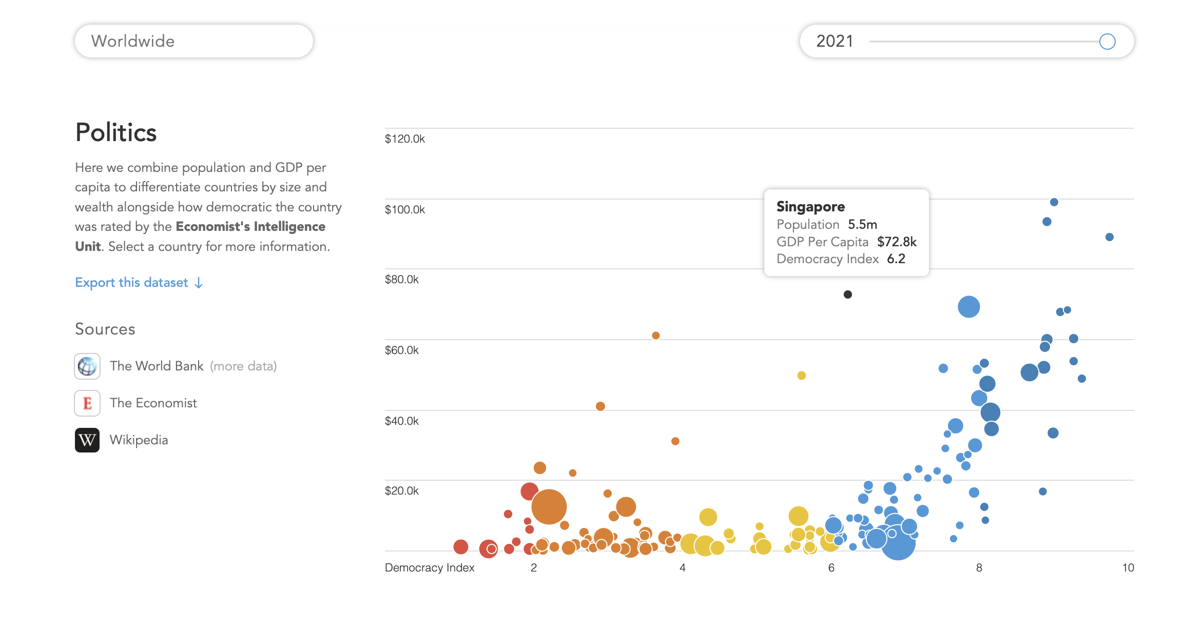 [OC] Interactive comparison of democracy index, population and gdp per capita
Submitted by skipjack- t3_ywhbhr